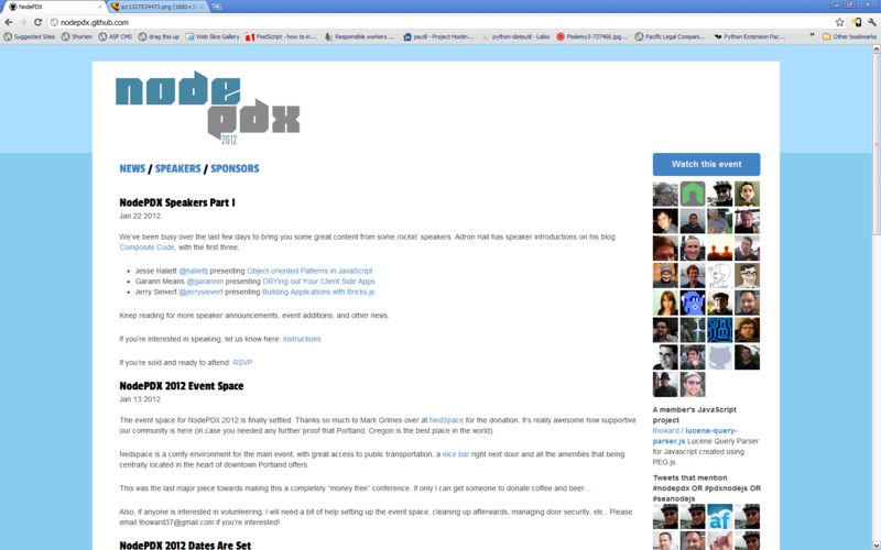
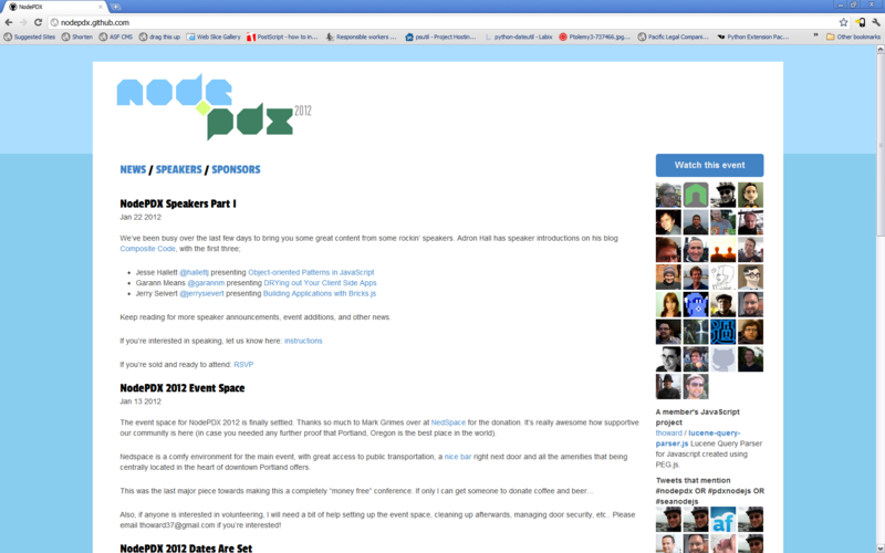
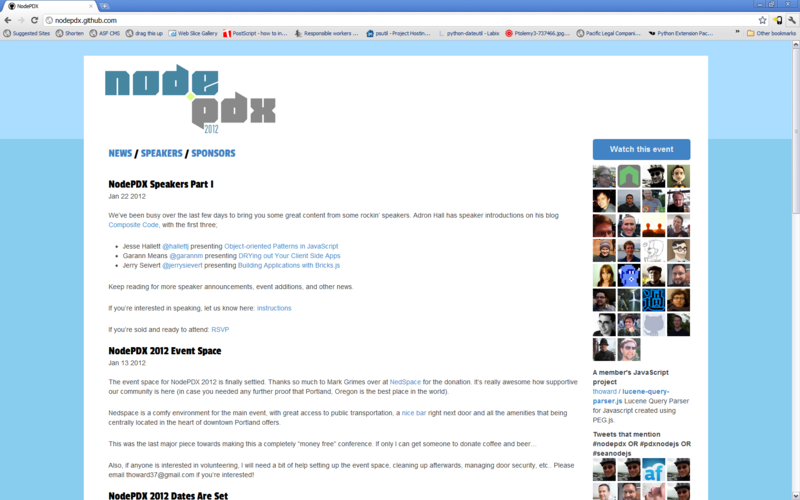
I'm working with designer Julie Olver to create an awesome logo for NodePDX 2012. Here's the initial concept she sent over today:
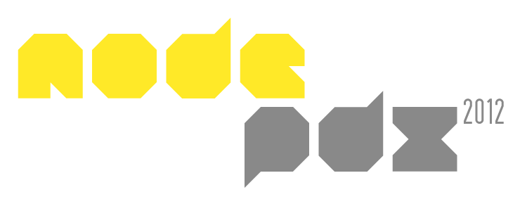
I liked that, but thought two things: the "dot" in "Node (dot) js" is kind of important and I wasn't too excited about yellow (what will it look like in a b/w print out)? So I made some color suggestions and a crappy square dot.
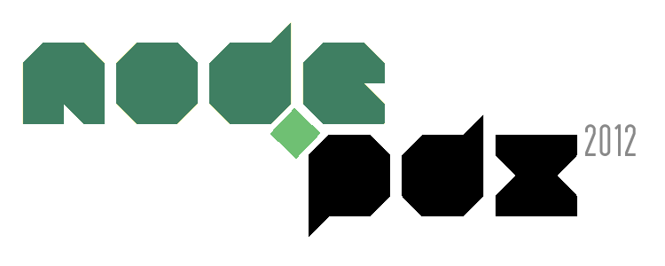
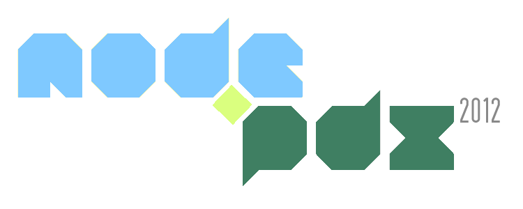
Also the font was not terribly legible, so she mocked up the logo with some other font choices:
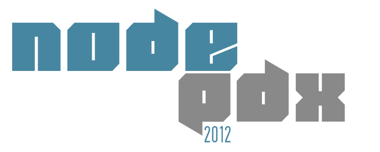
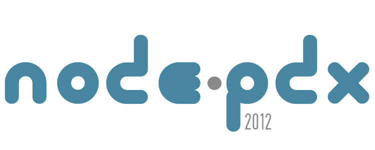
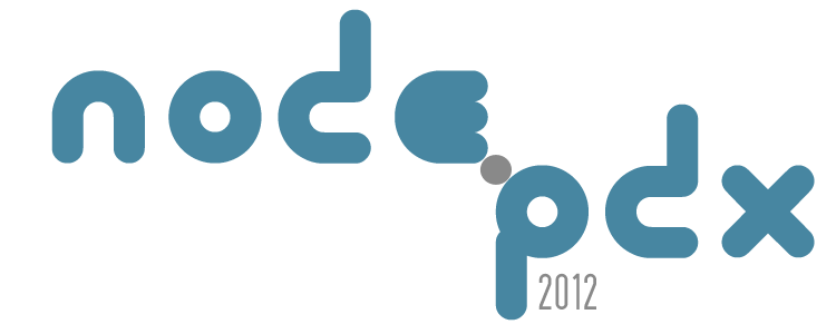
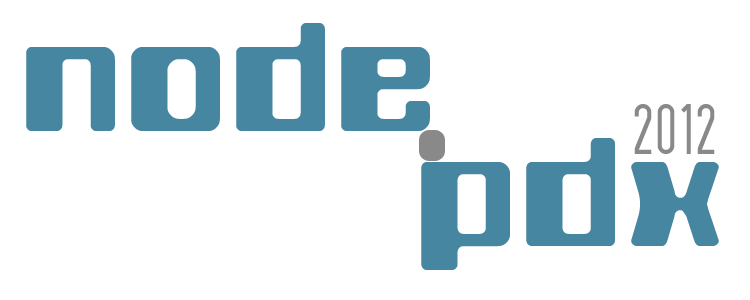
Working with Julie is great. She takes feedback to heart and turns around new ideas quickly. I'm really lucky that she's willing to donate her time and energy, for free, to help out our community conference. Portland is a great place with an awesome community of talented creative people.
Unfortunately they all look a little too awesome… which means I can't decide. What a terrible problem to have!!
So dear readers, thoughts? Which one do you think looks the best?
UPDATE:
Here's another variation on the logo concepts and some "in the wild" screenshots of what it would look like on the NodePDX website.
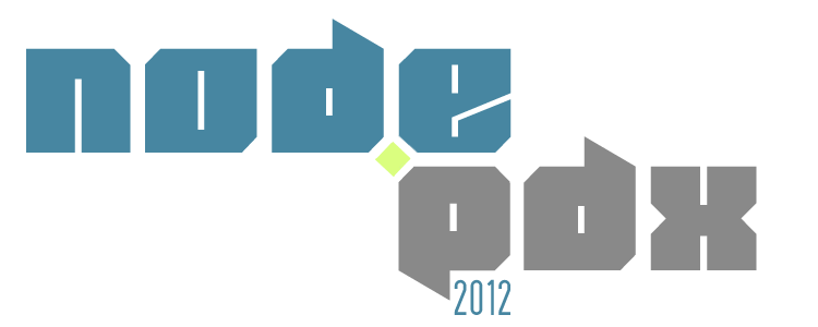
Screenshots:
